14 Golden Rules of Ux Writing. How to Write Like a Content Designer —… by Andrew Tipp Bootcamp
14 golden rules of UX writing. How to write like a content designer —… | by Andrew Tipp | Bootcamp #
Excerpt #
Writing is just as important to UX design as pushing pixels. For all the focus on Figma and design systems, it’s easy to forget that content is the reason people actually use your product. It’s also…
How to write like a content designer — and why it matters. #
[

]( https://medium.com/@andrewtipp?source=post_page-----946d37706334--------------------------------)[

]( https://bootcamp.uxdesign.cc/?source=post_page-----946d37706334--------------------------------)
Your words are important. Make them count — image by Kaitlyn Baker
Introduction #
UX writing isn’t just about writing content. It’s about designing content.
Writing is just as important to UX design as pushing pixels. For all the focus on Figma and design systems, it’s easy to forget that content is the reason people actually use your product.
And the core content for most websites and apps is written content.
Your writing shapes user understanding, behaviour and ultimately their satisfaction with a product.
That’s a lot of responsibility.
It’s also a challenge, considering most people do not read online, they scan — typically consuming less than a third of each webpage.
So how can you ensure your writing is usable, accessible and provides a good experience? By following these 14 golden rules:
- Start with user needs
- Use progressive disclosure
- Use headings to create structure
- Create a visual hierarchy
- Front-load text
- Use bullet points for lists
- Use plain, simple language
- Be concise
- Use sentence case by default
- Explain acronyms and initialisms
- Use descriptive, unique link text
- Write appropriate alt text
- Optimise your microcopy
- Use a consistent tone of voice
Now let’s take a look at some detail for each rule…
1. Start with user needs #
Take a user-centred approach — image by Ilyuza Mingazova
Before you start writing, ask yourself what people need from the content.
You should consider:
- Who are you writing for?
- Why are they using this content?
- What are they trying to do?
- How will this help them?
- Where do they need to go next?
These are fundamental content design questions. If you can’t answer them, you’re not ready to start writing.
Make a plan: note down all the questions users might have, then re-arrange them in order of importance. You now have a skeleton outline to work from.
For example, on a job webpage advertising a UX design role a user might ask:
- What is the job / company?
- Where is the role based — office, remote or hybrid?
- What’s the salary — and is this negotiable?
- What qualifications, skills and experience is required?
- What does the application process look like?
- Who is this role suitable for?
- How do you actually apply?
- When’s the closing date?
Once you’ve got an idea of the prioritised user needs, you’re ready to start writing — beginning with the most important information…
2. Use progressive disclosure #
It sounds like a risqué 90s Demi Moore thriller, but progressive disclosure is effectively a variation of the inverted pyramid.
The concept is simple: present users with the most important information first; allow users to explore more content if they need it.
Content designers use different UI patterns for progressive disclosure, such as tabs, accordions or simply scrolling to gradually reveal information that’s more complex or less relevant.
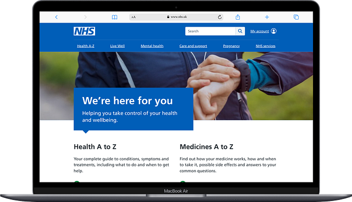
A good example of progressive disclosure in content design is GOV.UK’s bank holiday dates. Most users want to know the next bank holiday in England and Wales, so that’s big, bold and basically unmissable. Bank holidays further in the future and for other countries are still available, but they’re hidden or less prominent.

Bank holiday dates on GOV.UK
This article also uses progressive disclosure: the most important information — the rules — are stated in the introduction; readers can then explore the full content if they want to.
The benefits of progressive disclosure are that it reduces the:
- cognitive load from processing a lot of information at once
- time and effort spent by users trying to make sense of the content
- risk of people missing important or time-sensitive information
The downside of progressive disclosure is that it increases interaction cost. However, the benefits make it a worthwhile trade-off.
3. Use headings to create structure #
Headings help make your content easy to scan. So structure your writing with descriptive, nested headings.
Good heading structure supports the layer cake reading pattern. This is where users skip through the content skim-reading the top ‘layers’ of your content — the headings — to get an idea of the information.
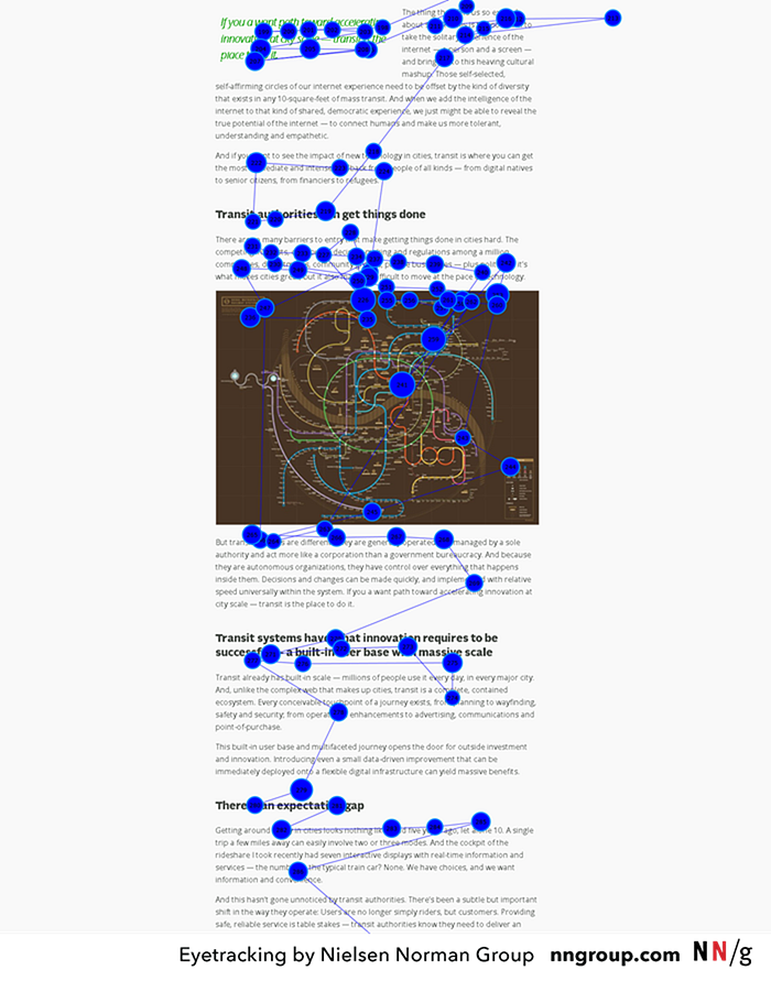
Layer-cake reading pattern — image by Nielsen Norman Group
Here’s how to do it:
- Start with Heading 1 for the title of the content
- Use Heading 2 tags to format the content into sections
- Use Heading 3 to divide the content within each H2 section
- If required, use Heading 4 to create further sub-sections
This approach especially helps people using assistive technology like screen readers to quickly ‘jump’ through the content and understand what it’s about.
You may have read that people read online in an F-pattern. That’s true, but there’s also a bit more to it than that. The truth is that as UI layouts have evolved, so too have different reading patterns.
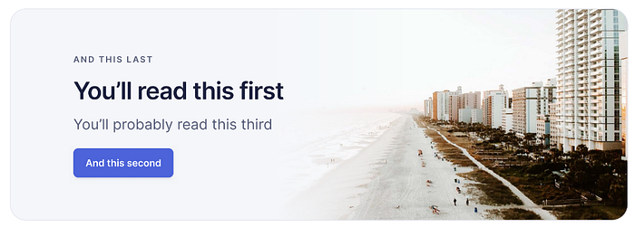
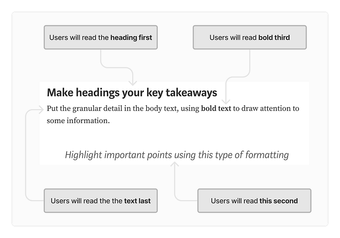
4. Create a visual hierarchy #
Visual hierarchy is another structural technique that makes content easier to scan.
Visual hierarchy is the organisation of layout elements to guide the user’s eye through the content in a specific order.
We respond to visual hierarchies subconsciously, following UI patterns designed for a reading order based on the visual layout rather than simply top-to-bottom order.
Visual hierarchy demonstrated by Adham Dannaway in Practical UI
But creating visual hierarchies is not just a job for UI designers: it’s a technique available to UX writers and content designers.
You can create a visual hierarchy by crafting headings, text, bold text and other formatting features to guide the reader’s eye through the content in a specific order — supporting reading patterns like the layer cake.
Creating a visual hierarchy writing on Medium — image by author
5. Front-load text #
Another technique for easy scanning is to front-load text.
Front-loading text simply means putting the keywords first in a heading or bullet list.
For example, ‘Front-load text’ is a better heading than ‘Ensure text is front-loaded_’_. When users are scanning, the keyword-first approach helps them understand what each section is about with the least possible effort.
If every heading starts with phrasing like ‘Information about…’ users have to spend more time and effort reading to work out what that section is about.
This same principle applies to page titles — front-loading reduces cognitive load and make it quicker and easier to scan, e.g. when users review search engine results.
6. Use bullet points for lists #
Whenever you write a list, format it into bullet points. It’s easier to process lists when they’re neatly left-aligned rather than separated by commas in a paragraph.
Put some thought into the order of your list. The Serial Position Effect states that people tend to best remember the first and last items in a sequence.
Serial Position Effect — Image by The Decision Lab
So if there are key details you want users to recall later, consider making them near the top and bottom of the list.
As an alternative to bullets, consider a numbered list for things that happen in a specific order, e.g. step-by-step instructions.
7. Use plain, simple language #
You might have the most well structured, easy-to-scan content in the world, but that’s worthless if users can’t actually understand the information.
So your content must also be easy to read.
Readability is a basic requirement for accessible, usable content. It’s a fundamental goal for any UX writer or content designer.
Why does this matter? Because many people struggle to understand online information — especially if it includes numbers and statistics. For example:
- 16% of people in the UK have very poor literacy skills (at or below the level of an average 9 year-old)
- Most UK adults have a reading age of 11–14 year-olds and the numeracy skills of a 9 year-old.
The groups at highest risk of low literacy/numeracy skills include people with challenges such as:
- language barriers — because they’re not fluent in the ‘default’ language
- cognitive impairments — such as brain injuries or dementia
- learning difficulties — such as dyslexia, dyspraxia and attention deficit-hyperactivity disorder (ADHD)
- low education level (who are often from a lower socio-economic background — another barrier to digital inclusion)
Good UX writing helps a diverse range of people — image by UX Indonesia
What’s the solution?
- Write in plain English — use familiar, everyday words (following the usability heuristic Match Between the System and the Real World)
- Avoid jargon, technical information or legalese — if this can’t be avoided, provide a plain English explanation or summary alongside it
- Be specific and precise — avoid vague, ambiguous language
- use numerals for numbers, e.g. 7 instead of seven; 20,000 instead of twenty thousand (always include commas in large numbers)
It’s important to remember that plain, simple language benefits everyone — not just those with poor literacy skills.
8. Be concise #
Concise writing helps both scanning and readability.
Concision is a communication principle of eliminating redundancy — giving information in the fewest words.
How can you make content concise?
- Cut unnecessary words, e.g. form field labels — write ‘Email’ instead of ‘Your email address’
- Use short, simple words instead of longer, complex ones, e.g. ‘use’ instead of ‘utilise’
- Keep sentences short (25 words), and use short paragraphs — possibly even one line
- Use writing tools such as Hemingway Editor to highlight redundant words and long sentences
This article is not as concise or plainly written as it could be. However, there are situations where it’s appropriate to bend or break certain rules, e.g. when writing for a specialist UX/content design audience on Medium.
9. Use sentence case by default #
There are three main types of casing:
- Title case — used for titles of books or journals, e.g. The Catcher in the Rye or The Journal of User Experience
- Sentence case — where you capitalise only the first letter of a sentence and the proper nouns, e.g. Why UX design principles will be forever relevant
- Upper case — where every word is capitalised (also known as ‘all caps’)
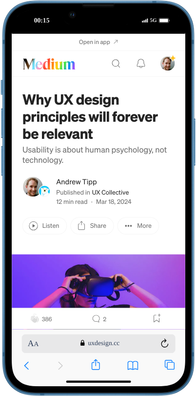
An article title using sentence case — image by author
There’s no consensus on which style is easier to read, as research has yielded conflicting evidence. But there are good reasons to recommend sentence case as the default style for UX writing.
Sentence case is simpler, cleaner, and easier to maintain consistency across a product or system.
For those reasons, it’s the the default style for UK government, health and education content guidelines. However, there are use cases for different letter casing across UI/UX design.
10. Explain acronyms and initialisms #
Do not assume users have prior knowledge of a product, service or system when they arrive at your content.
Write the full version of acronyms and initialisms the first time you mention them in a piece of content.
For example: ‘The Department of Health and Social Care (DHSC) works to…’ You can write DHSC from then on.
The exception to this rule is for anything better known by its acronym/initialism, e.g. BBC, NHS, GP and MP. In this case, writing these terms out in full could simply add unnecessary words.
The UK’s NHS is universally known by its initialism
11. Write descriptive, unique link text #
Users scan links the same way they do headings. But writing good link text isn’t just best practice UX writing — it’s also an accessibility requirement.
The Web Content Accessibility Guidelines (WCAG) criterion 2.2.4 Link Purpose (In Context) states: “The purpose of each link can be determined from the link text alone.”
What this means is links should make sense in isolation, without any other context. In other words:
Write link text that makes it clear what will happen when you use that specific link
For example, ‘ Texthelp readability guidance’ is unclear to people scanning content, but ‘ Texthelp readability guidance’ suggests both the destination and the context of what to expect when you get there.
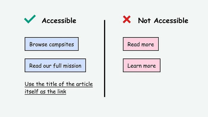
Examples of good and bad link text — image by Access Guide
To write good link text:
- avoid generic link text, such as ‘click here’
- avoid repeating link text for links with different destinations, e.g. using ‘Read more’ for buttons on a page that go to different URLs
- avoid formatting links as full URLs — screen readers will read out the whole thing
- avoid misleading link text, e.g. ‘Pay now’ if the link starts a 5-step checkout process instead of actually completing a payment — use ‘Checkout’ instead
- consider using verbs to turn some links into an action prompt, e.g. ‘Download the file’, ‘Visit our website’, ‘ Read the report’, etc.
12. Write appropriate alt text #
You’re probably aware that image alternative (alt) text is important for accessibility: people who use screen readers rely on their software to read out alt text so they know what an image shows.
But many people aren’t aware of the nuances involved in writing appropriate alt text. Because the way you write these descriptions should vary depending on the context.
Remember the purpose of alt text is to give blind and partially sighted people an equal experience of the image.
Some alt text descriptions can simply be minimal and factual. However, if an image is there to evoke certain feelings, your alt text should evoke the same feelings.
For example, for images related to:
- health and wellbeing — the alt text should evoke reassuring calm, peaceful feelings
- holiday destination — the alt text should evoke feelings of excitement and adventure
- luxury products — the alt text should convey a sense of quality, prestige and refinement
- fashion photo-shoots— the alt text should use visceral language to evoke feelings of desirability
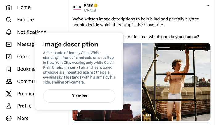
Royal National Institute of Blind People (RNIB) using descriptive, evocative alt text
Purely decorative images do not require alt text. Many screen reader users consider excessive alt text descriptions annoying and unhelpful. If the image is not adding value to a page, like a logo, it should be considered decorative and the alt text marked as blank.
13. Optimise your microcopy #
Do not overlook the importance of very granular aspects of UX writing. Subtle changes to content elements like call-to-action (CTA) buttons, article/video titles and newsletter subject lines can have a big impact.
A/B test microcopy to ensure the most effective variation is used — increasing engagement, conversions and revenue.
Good microcopy for elements such as notifications and error messages are also important for usability — giving users helpful and appropriate feedback about the product or system status.
An example of good microcopy writing advice from UX Tools
If you don’t have the budget or resources to carry out A/B testing using software tools, do the next best thing: show variations to people and ask which one they’d be more likely to engage with.
I’d recommend against maximising engagement at all costs. Click-baiting users can undermine trust, harm your reputation and damage your brand long-term.
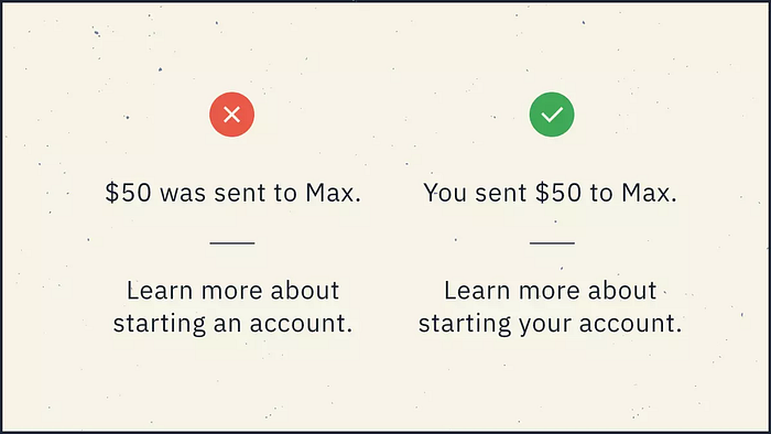
14. Use a consistent tone of voice #
There’s no objectively correct tone of voice — it all depends on the context. What works for one brand targeting a specific type of user might not for another.
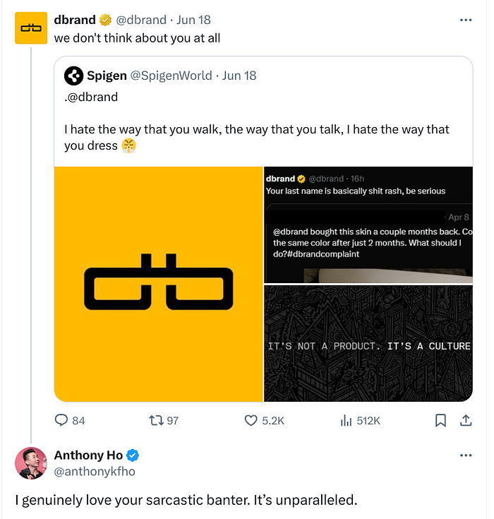
dbrand’s tone works for its customers — image by author
But whatever your brand tone of voice, be consistent.
Your tone of voice should be consistent on your website, social media, customer service emails — any channel you interact with users.
Sudden changes in tone of voice can be jarring. At best, inconsistency is simply confusing. At worst, it might make users question your authenticity (i.e. wonder if they’re being scammed).
A few good practice suggestions for tone of voice:
- Use the active voice instead of passive language — for example, ‘You can buy our new product today’ not ‘Our new product can be bought today’.
- Use positive contractions such as you’ll, we’ll and you’re which sound more human; but consider avoiding negative contractions like don’t and can’t — users can mistake them for the opposite meaning (e.g. say ‘do not’ instead)
- Create style/content guidelines that explain your tone of voice, and promote it as a resource internally
- Ensure your design system documentation includes any style/content guidelines around tone of voice
Summary #
Here are the key takeaways for these 14 golden rules of UX writing:
- Start with user needs — create a skeleton outline of your content based on prioritised user questions
- Use progressive disclosure — present users with the most important information first; allow users to explore more content if they need it
- Use headings to create structure — this supports the layer cake reading pattern, helping users scan your content
- Create a visual hierarchy — use formatting features to guide the user’s eye through the content in a specific order
- Front-load text — where possible put keywords first in headings, bullets and other formatting to make scanning easier
- Use bullet points for lists — this breaks up the content and is clearer than listing things in paragraphs
- Use plain, simple language — use everyday words, avoid jargon, be specific and precise
- Be concise — cut unnecessary words, keep paragraphs and sentence short (25 words) and use editing tools
- Use sentence case by default — it’s cleaner, simpler and easier to maintain consistency across a product or system
- Explain acronyms and initialisms — write it out in full the first time, although there are exceptions
- Write descriptive, unique link text — make it clear what will happen when people use the link, avoid generic, repeated or URL link text
- Write appropriate alt text — tailor the image description to the context to give an equal experience of the content
- Optimise your microcopy — craft the best possible wording for buttons, titles and subject lines, plus elements like alerts and notifications
- Use a consistent tone of voice — talk to users the same way across every channel, and explain how to do it in style/content guidelines
About the author #
Andrew Tipp is a lead content designer and digital UX professional. He works in local government for Suffolk County Council, where he manages a content design team. You can follow him on Medium and connect on LinkedIn.