5 Simple Tips to Make Your Hashnode Feel More Professional
5 Simple Tips to Make Your Hashnode Feel More Professional #
Excerpt #
If, like me, you have recently started blogging here on Hashnode, you might be looking for ways to make your blog appear more professional. When you’re first starting out, it can be difficult to immediately have polished branding and grammatically pe…
If, like me, you have recently started blogging here on Hashnode, you might be looking for ways to make your blog appear more professional. When you’re first starting out, it can be difficult to immediately have polished branding and grammatically perfect articles. So here are 5 simple and easy tips to level up your Hashnode today:
1. Use a custom domain #
Hashnode makes it very easy for you to link a custom domain to your blog, which can help create a level of legitimacy for your site. Many of the visitors to your blog will be from outside of the Hashnode community. They may becoming from Google or a link on your other social media accounts. Landing on a page that is owned by you helps them to trust you as a leader in your niche.
There are many good sites where you can buy a custom domain cheaply, including GoDaddy or Vercel.
2. Add a custom favicon to your blog #
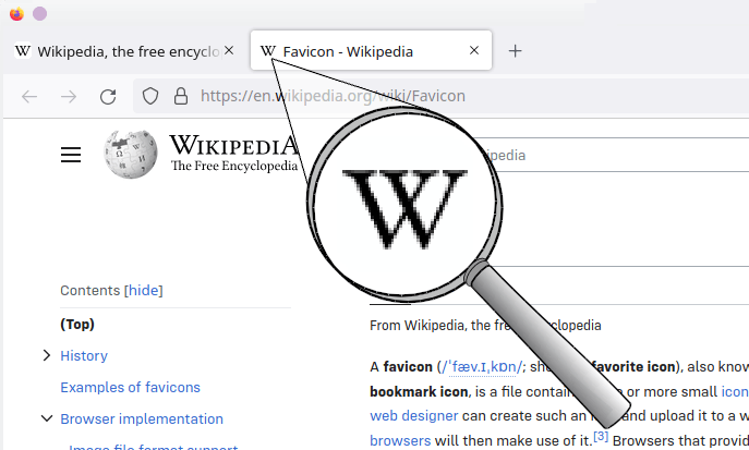
If you’re not a web developer or designer by trade, the favicon is the small icon on a website’s tab bar.

By default, all Hashnode blogs have the Hashnode cog logo as their icon, but you can change this in your blog appearance settings. This will also add to the legitimacy of your blog, separating it from the thousands of other Hashnode blogs.
If you want to keep it simple but effective, you can generate a favicon, for free, on favicon.io. Simply pick an emoji, or use the first letter of your name combined with your favourite font. Or you could try your hand at some pixel art and create a completely unique favicon here.
3. Create a logo for your blog #
Another, great feature Hashnode makes easy to customise, is your blog logo. This can easily be changed in the appearance tab, in your blog dashboard. They even allow you to upload a different version for dark mode, so that it will always stand out.
If you’re worried about your graphic design skills, then don’t be. Nowadays, you don’t need to be a graphic designer to create simple and effective graphics using tools like Canva. I recommend adapting one of their built-in logos which you like. It is important to remember to use a transparent background for a clean and polished look (you can sign-up on Canva for a 30-day free trial to access this feature).
4. Add article header images to all your articles #
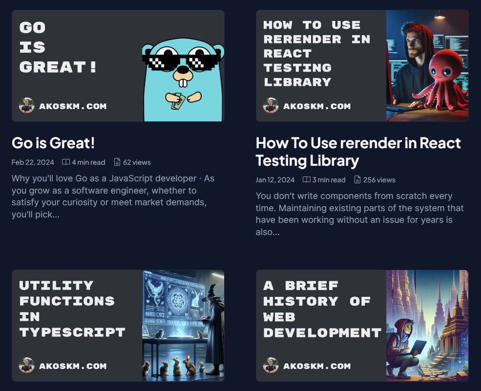
It is often said that “a picture is worth a thousand words”, and that “the average attention span on the internet is five seconds”. When you combine these two ideas, you realise that pictures are an important tool in capturing any of your potential readers’ attention and getting them to stick around.
Again if you are worried about your design skills there are lots of great templates on Canva. Remember the titles don’t need to be complicated to be effective. I particularly like akoskm and Cognitive Computations’ article headers because they keep them simple and consistent. Here are some examples from akoskm’s blog, to inspire you:

A great alternative to creating article headers is to utilise Hashnode’s built-in Unsplash selector. Unsplash gives you access to thousands of high-quality, free-to-use, images that will look professional on your blog. To use this, next time you are writing an article, simply select ‘Add a cover’, then select the ‘Unsplash’ tab and search their vast collection.
5. Customise the CSS of your blog #
Hashnode, like many great blogging platforms, allows you to customise the CSS of your blog. In your blog dashboard, appearance tab, look for the customise CSS button. You can edit and amend the generic CSS for your home page, your article and any pages you have.
Don’t worry if you’re not a front-end web developer it is very easy and simple to get started. Avneesh Agarwal has a great tutorial here on how to edit the colours of your site to be more consistent with your brand. Personally, I am still deciding on my branding and colours, but wanted to make my site more interactive and polished with a few CSS animations. Inspired by Victoria Lo’s blog, here are the animations I have added so far:
<span>.blog-author-area</span> {
    <span>overflow</span>: hidden;
    <span>animation</span>: slideIn ease <span>2s</span>;
    <span>animation-iteration-count</span>: <span>1</span>;
    <span>animation-fill-mode</span>: forwards;
}

<span>@keyframes</span> slideIn {
    0% {<span>max-height</span>: <span>0</span>;}
    100% {<span>max-height</span>: <span>500px</span>;}
}

<span>.blog-theme-switcher</span>{
    <span>animation</span>: rotate <span>1s</span>;
}

<span>@keyframes</span> rotate {
    0% {<span>transform</span>: <span>rotate</span>(<span>0deg</span>);}
    100% {<span>transform</span>: <span>rotate</span>(<span>360deg</span>);}
}

<span>.blog-posts-wrapper</span> {
    <span>justify-content</span>: space-between;
}

<span>.blog-post-card</span> {
    <span>transition</span>: .<span>6s</span>;
    <span>width</span>: <span>48%</span> <span>!important</span>;
    <span>padding</span>: <span>1.2rem</span> <span>!important</span>;
    <span>border-radius</span>: <span>12px</span>;
    <span>border</span>: <span>1px</span> solid <span>rgba</span>(<span>255</span>,<span>255</span>,<span>255</span>,<span>0.20</span>);
}

<span>.blog-post-card</span><span>:hover</span> {
    <span>box-shadow</span>: <span>0</span> <span>8px</span> <span>32px</span> <span>0</span> <span>rgb</span>(<span>177</span> <span>156</span> <span>217</span> / <span>60%</span>);
}

<span>.dark</span> <span>.blog-post-card</span><span>:hover</span> {
    <span>box-shadow</span>: <span>0</span> <span>8px</span> <span>32px</span> <span>0</span> <span>rgb</span>(<span>255</span> <span>255</span> <span>255</span> / <span>40%</span>);
}

<span>@media</span> (<span>max-width:</span> <span>620px</span>) {
    <span>.blog-posts-wrapper</span> {
        <span>justify-content</span>: center;
    }

    <span>.blog-post-card</span> {
        <span>width</span>: <span>96%</span> <span>!important</span>;
    }
}
Feel free to use these as you will. Personally, I am using the “Grid Layout” (you can change this in your dashboard, appearance settings) for my home page, so the selectors you need to use for other layouts may vary.
Remember to always test any changes for mobile responsiveness!
Bonus: 6. Add a few pages to your site #
One commonality I have noticed between lots of the best-achieving blogs on the site is the use of pages. Pages can be added using markup on the pages tab of your dashboard. (Remember to add them to your Navbar afterwards!)
Adding pages allows you to direct any new visitors to your blog to your particular areas of interest. This can be a separate page or even just an article series. This gives new visitors more of an idea of what you are about and makes your blog much easier to navigate.
Good page ideas to start with:
About Me - Introduce yourself, why do you blog, what can you offer readers?
Resources - What are some of the best resources you use all the time, within your area of expertise?
Books - This echos a resources tab, what books do you think everyone should read?
Your favourite series/collection of articles you’ve written
Thanks for reading!
Do you have any other tips to improve your Hashnode? Let me know in the comments, or just say hi 👋.
Until next time, Happy Coding!