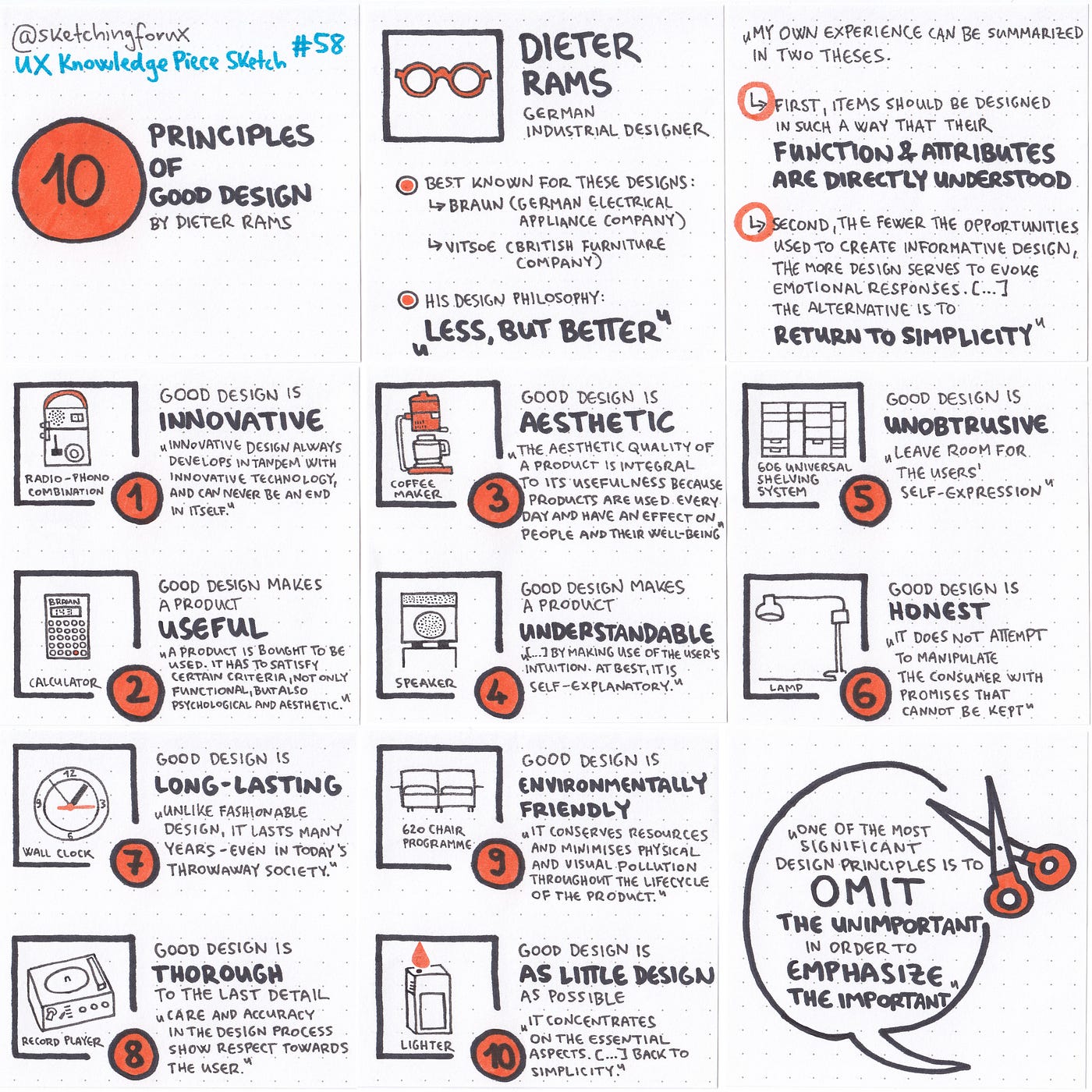
10 Principles of Good Design by Dieter Rams by Krisztina Szerovay Mar, 2024 Ux Knowledge Base Sketch
10 Principles of Good Design by Dieter Rams | by Krisztina Szerovay | Mar, 2024 | UX Knowledge Base Sketch #
Excerpt #
“My own experience can be summarized in two theses. First, items should be designed in such a way that their function and attributes are directly understood. For design, this is an opportunity and a…
UX Knowledge Piece Sketch #58 #
As a digital designer, you should get inspired by industrial designers #
[


]( https://uxknowledgebase.com/?source=post_page-----7b9384285667--------------------------------)

10 Principles of Good Design by Dieter Rams — UX Knowledge Piece Sketch #58
A great inspiration #
Dieter Rams is a German industrial designer best known for his design work at:
- Braun (German electrical appliance company)
- Vitsoe (British furniture company)
His design philosophy is “less, but better” (“weniger, aber besser”)
“My own experience can be summarized in two theses. First, items should be designed in such a way that their function and attributes are directly understood. For design, this is an opportunity and a challenge. […]
Second, the fewer the opportunities used to create informative design, the more design serves to evoke emotional responses. This is not always conscious but more or less instinctive, created by fireworks of signals that the products send out. Often these responses are so intense that they are confusing. I try to fight against them. I don’t want to be dominated, nor do I want to be excited, stupified, or amazed. […]
The latest design trends are intended to evoke emotions by trivial, superficial means. It is not a question of information for use, nor a problem of insight and perception in a broader sense. The issue is stimuli: new, strong, exciting, and therefore aggressive signals. The primary aim is to be recognized as intensely as possible. The aggressiveness of design is expressed in the harshness of combat to attain first place in people’s perception and awareness and to win the fight for a front place in store display windows. I don’t support dull or boring design but I do take a stand against the ruthless exploitation of people’s weaknesses for visual and haptic signals, which many designers are engaged in. The festival of colors and forms and the entertainment of form sensations enlarges the world’s chaos. To out-do each other with new design sensations leads nowhere. The alternative is to return to simplicity. And that requires working hard and seriously.” (Omit the Unimportant, Design Issues, Vol. 1, №1 (Spring, 1984), pp. 25–26)
10 principles of good design #
Good design…
- is innovative: “[…] innovative design always develops in tandem with innovative technology, and can never be an end in itself.”
- makes a product useful: “A product is bought to be used. It has to satisfy certain criteria, not only functional but also psychological and aesthetic.”
- is aesthetic: “The aesthetic quality of a product is integral to its usefulness because products are used every day and have an effect on people and their well-being.”
- makes a product understandable: “[…] by making use of the user’s intuition. At best, it is self-explanatory.”
- is unobtrusive: “Their design should therefore be both neutral and restrained, to leave room for the user’s self-expression.”
- is honest: “It does not attempt to manipulate the consumer with promises that cannot be kept.”
- is long-lasting: “Unlike fashionable design, it lasts many years — even in today’s throwaway society.”
- is thorough: “Nothing must be arbitrary or left to chance. Care and accuracy in the design process show respect towards the consumer.”
- is environmentally friendly: “It conserves resources and minimises physical and visual pollution throughout the lifecycle of the product.”
- is as little design as possible: “it concentrates on the essential aspects, […], back to simplicity.”
Btw., if you design in Framer, you must check out this resource created by Lee Black and Karime Möll (try out the components, and make sure to check out the sound design, too!):
Drams — Framer components inspired by Dieter Ram’s design principles